“Annual Reports are boring. It is important, no doubt, but to a creative person, it offers few ways to showcase creative skills.”
I remember saying this to the intern designer, 5 years back, who has just joined our company.
She was a fresher but a smart kid. What I really admired about her was her curiosity. She never seemed to settle and was always asking questions
The month of May heralds the annual reports season at any design agency and we were gearing up for the ‘rush hour’ to begin. One of the first meetings was with a microfinance company.
“We want it to be very creatively done” said the corporate communications manager, but then who does not!
I dutifully nodded my head, so did my team, and spent the rest of my time wondering how to be creative with an annual report for a microfinance company. I mean, it is not that they make soft toys or ice ice-cream
The next day we started researching the company and looking at annual reports of other microfinance companies. They mostly featured rupee notes and smiling faces.
“Instead of thinking it is boring why don’t we think of it as interesting,” asked the intern innocently. “We can always add a splash of colour, some infographics, showcase the positive parts in a different way and most importantly weave a story out of the people who work for them and who they work for”
At first I was a bit irritated but then I realised she had a point. Creativity, after all, is seeing things from a different perspective
“Instead of complaining about how little material we have let’s create material.” I said to myself.
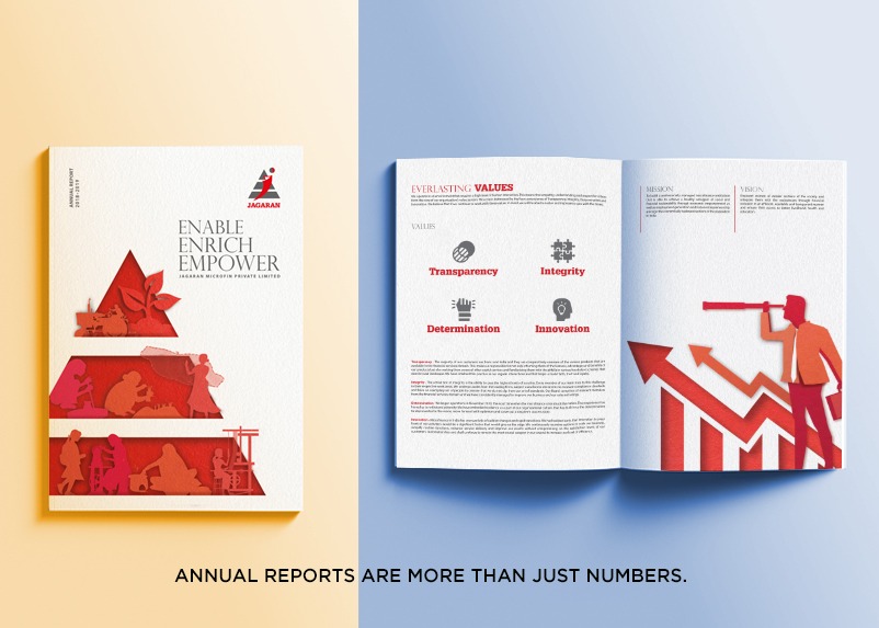
We decided that instead of looking at microfinance as money, we could look at it as lives. After all, there are so many lives within this company, so many voices, so many faces, so many stories. While weaving life stories into an annual report might sound a little absurd, it does make a more engaging piece of reading.
While the copywriters worked on creating the content and headlines, we complemented them with some bright graphics and intricate imagery that demanded a second look. Instead of highlighting the directors, we showcased the people they have benefitted, which included their own lower-grade staff.
We also used infographics heavily, secure in the knowledge that an infographic is 30 times more likely to be read than a pure-text. They not only look dynamic and engaging, but are a tool to draw attention to your most important information; which tend to get lost otherwise. They certainly provide a design edge to any publication.
The final result did change my view of Annual Reports from ‘It must be boring; to ‘it can be fascinating’. When we passed the dummy around, we found people were actually spending time on the pages instead of simply flipping through. Since then I have carried the lesson into any annual report I design, even if it takes twice the time to create as before.
To check out some Annual reports done by me, follow Anderson Printing House.